The paradox of the active user is a concept, first defined by IBM researchers Mary Beth Rosson and John Carroll (Interfacing thought: cognitive aspects of human-computer interaction, 1987). They saw that new users weren’t reading manuals provided with their new computers, and would instead just dive right into using them, even if they came across any errors and roadblocks.
Users were more motivated by their goals, not caring too much about the system of the computer itself. It’s considered a paradox because users could get so much more from their computers if they sat down and learned about it upfront, but they also knew that’s not how people behaved in the real world.
What I find interesting about this is that this is a fundamental human behaviour, and it’s not a design problem to be solved. And if this is a fundamental human behaviour, no amount of explanation or more guidance earlier isn’t going to help if people are going to dismiss it anyway. Guidance should always be accessible throughout the experience, and be contextual to use so we can be available to new users, regardless of the path they take.
Makes you also wonder, if you need to explain the thing, is your design too complex? Situated learning (AKA, learning by doing) is more effective than trying to teach someone through books, videos, or other information. People don’t read.
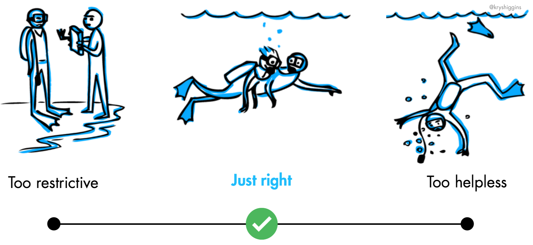 An illustration by Krystal Higgins about guided interaction
Good guidance, based on Krystal Higgins’ article on engaging new users: Guided Interaction, will facilitate exploration in an authentic space, gradually engage, provide clear next steps.
What Good Guidance looks like in digital products
-
Inline Cues — hints, suggestions, tips embedded into the UI, instead of above, or upfront
- Doesn’t disrupt the users interaction
- eg., empty states
- A physical world example is an icon on paths that show which side is for cyclists and which side is for walkers
- Best when it’s contextual to the user’s state
-
Playthrough Tutorial
-
In gaming, players move at their own pace, triggering text or audio/visual guidance as they complete certain tasks
-
Best used for more complex tools or novel technologies and interactions, not things that are already familiar
-
The key is to not block them from interacting
But good guidance also means being selective. You don’t want your guidance to add frustration to the user’s experience.
- Don’t waste the user’s time. Don’t educate about obvious interactions, like pointing to a share button and telling a user that this is how she should share. Solve those kinds of problems in your core UI and focus education on the big, standout tasks in your product.
- Avoid modal dialogs. A user can’t learn in context if they’re being kept from it by a pop-up message that doesn’t allow someone to interact with the UI it’s informing them about.
- Allow escape. Give folks the ability to get rid of or get out of guidance. There are always people who have used your product before and may have been misidentified as a new user, or those who just like to jump straight into complexity
-
Further reading
title: "Onboarding and the active user paradox | Krystal Higgins"
image: "https://www.kryshiggins.com/wp-content/uploads/2018/08/Paradox-active-user-illustration-1024x602.jpg"
description: "“New users aren’t discovering our features. Can we make them watch a video or do a tutorial before they get started?”"
url: "https://www.kryshiggins.com/active-user-paradox/#more-5150"