Fluid grids and typography in web is so easy to design in Figma, way harder to implement in dev. I don’t think I really understood the value of a rem until last week, where I was investigating how The Art of Documentary did their responsive layout.
At first, I was shooketh because of how smooth the responsive behaviour was.
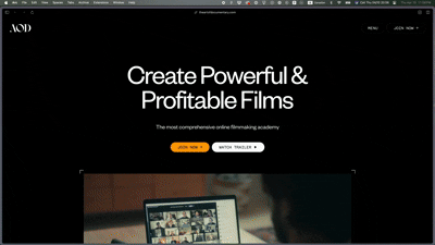 Butter!!! (except for that breakpoint where you twinge a little from how tiny it gets. You know the one.)
After a couple days of trial and error, and a bunch of dumb math javascript, I found that the key to this was:
:root {
--gfs: 1rem; /* I assumed this was a global font size */*
}

html {
  font-size: 1vw;
}

/*literally anything that uses a number: margins, padding, font-size, width, line-height...*/
h1 {
  font-size: calc(80 / var(--gfs)*1rem)
}
^ 80 would be the value in pixels that it was originally designed in.
I was pretty stoked to have it scale exactly like this:
 Butter!!! Though I showed my dev + design friends and they did mention that this was an accessibility issue (not just for that breakpoint, but the zoom functionality wasn’t registering it.)(No, the zoom functionality was, indeed, registering it. On Safari. But not on Chrome or Firefox. I hate browser inconsistency.)
Viewport sizing, especially for text, doesn’t play nice with zoom accessibility. This seems like a wonderful implementation (if we added more breakpoints, maybe) but not being accessible is a dealbreaker for me (and anyone else that appreciates function over form).
Some solutions to consider:
- We can make it accessible by swapping out the viewport sizing and calc math in favour of clamps
- Don’t be extra, just go back to traditional breakpoints and don’t worry your beautiful brain
What’s fucking hilarious to me is that I specifically said to another thought partner, ‘oh, so clamps wouldn’t be a good idea to implement on a system scale, but rather more useful at an element scale’. Full circle.
But I can’t go back to traditional breakpoints, not after knowing that there’s better out there. And now I’m stuck having to perfect this clamp business.
What an interesting problem to have.
For all elements, I can swap the 1vw font-size to 100% and use clamps to define the min value, preferred value, and a max value, using rem.
- Keeping the
html {font-size: 100%}isn’t actually necessary since it already defaults that way, but it’s good defensive practice to leave it in case there are any overrides, and to ensure consistency throughout browsers. Looking at you, Safari.- It also respects the user’s preference, in case the text is larger for accessibility reasons.
- It’s also compliant with WCAG baybee
Upon further contemplation, I realized that maybe — actually — The Art of Documentary’s implementation of fluid grids + typography was a lazy hack job. Maybe it could have benefitted from an extra breakpoint, or even considering a solution for accessibility reasons. The aspect ratio effect was cool until I realized it’s giving PNG. Hard to read at a smaller scale before it hits the mobile breakpoint.
Still sick tho.
Resources
Some resources I found as I researched the thing
- https://caniuse.com/ — From Lloyd, it will save the headache of going too far before you realize something isn’t supported
- https://www.marcbacon.com/tools/clamp-calculator/ — a clamp calculator, it’s in the name. Very useful if you don’t wanna math
- Shout out Inspect, I wouldn’t have found the font-size: 1vw if it weren’t for you, boo