I’m currently tasked with designing an internal tool to visualize an organization’s company chart AKA I’m about to rabbit hole on some unconventional data visualization to make something cool and useful for employees to see their relationships between teams and departments.
For NDA purposes, I won’t be talking specifics, but rather methods and terminology I’m coming across as I visualize this data.
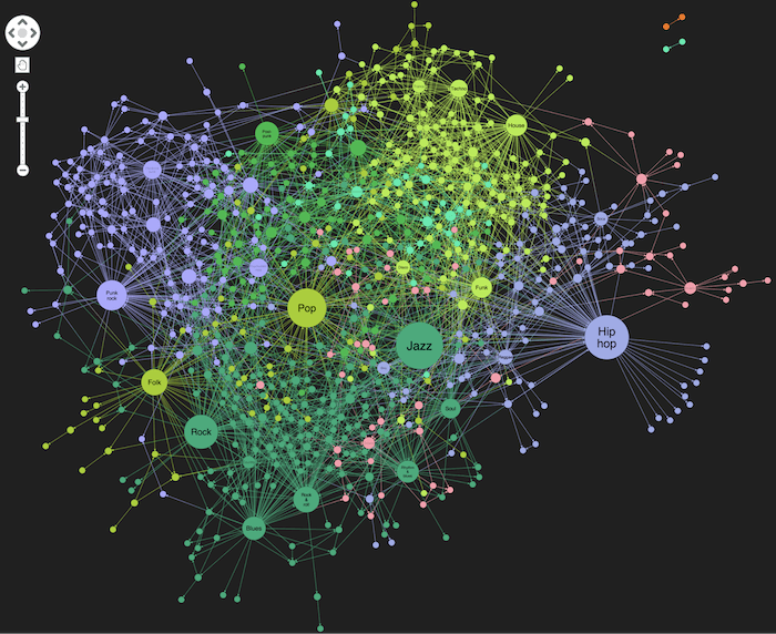
My biggest challenge (other than actually creating the visualization) is finding a visualization that communications relationships, and less hierarchy. I don’t have the language to search for the right visualizations — I thought maybe “network” or “bubble plot” made sense, but as I usechatgpt to visualize my fake data, it seems to be more intense and hairy.
 My hope is that I can visualize this org chart similar to this NSFW Subreddit map:
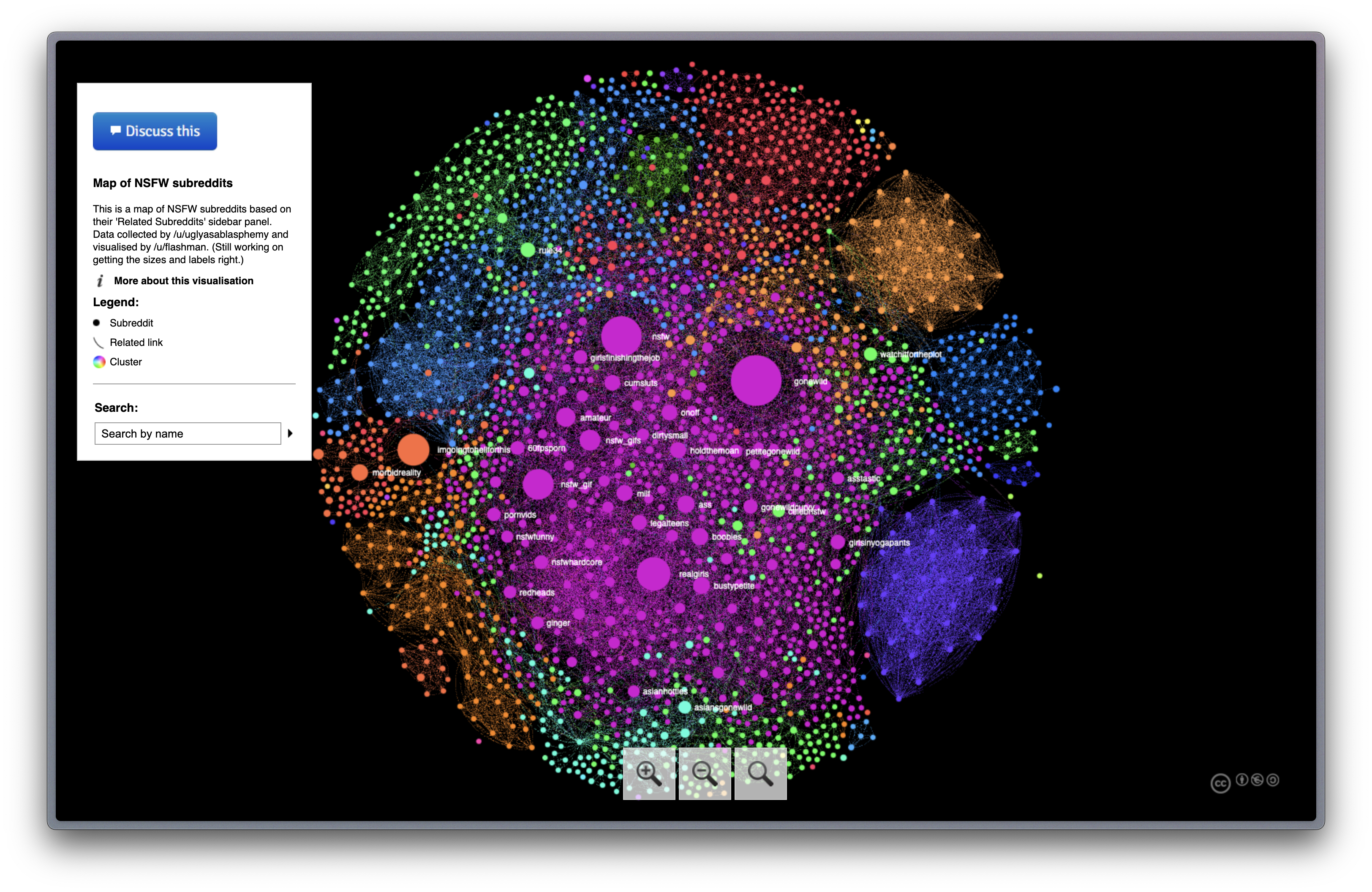 I know — it’s not a conventional way of visualizing an organization’s hierarchy. Conventional is seeing the CEO at the top of a tree view and seeing subsequent VPs, managers and reports all the way down to its roots, where you can see that tree or triangle shape. But the focus is less about communicating hierarchy (in a tree view) but more about the relationship between individual/team.
In truedesign fashion, there are many ways to visualize hierarchy:
- Colour (groups that are “similar” will have the same colour)
- Size (groups with many people will be larger)
- Location (maybe groups in the middle have more significance than whatever’s outlying in the outskirts)
- Labels (showing at a certain point of zoom)
Some other visualizations worth looking at:
- Network analysis/clustering
- Hierarchical clustering on a spanning tree (HCS Clustering)
- Louvain method