Currently looking for an appropriate typeface for a client’s brand and really liked the idea of using an ink trap typeface. In the digital era, there’s less use for it since ink trap typefaces had a functional use in print (literally trapping ink in the notches designed in the letterforms to prevent it from looking blurry and uneven). Nowadays, they’re better off being used in small sizes and lower-resolution screens.
In the 20th century, ink traps ensure that ink spreads evenly to prevent it from blotting or pooling in areas where the strokes of a letterform meet or intersect. The notches designed in the letterforms offer a way out for ink so that it maintains their shape, resulting in clearer, more legible text. Letterpress technology back then needed this kind of attention to detail.
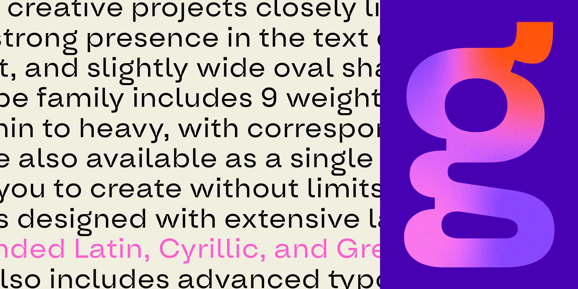
Type Forward designed their own spin to it with Oddval, which gives it a more quirky geometric feel. Hope the client likes it.
They had also referenced Toshi Omagari’s writing about Ink Traps and Pals. TIL ink traps are less a shape and more of a technique. There are different shapes of ink traps, and they suggest that it’s more about intent than it is about shape.
Though it’s not the main premise of the piece, they referenced the UN logo using ink traps, which blew me away. My take away is that using these small notches help create the negative spacing we need to visually articulate these shapes to maintain the integrity of the larger image.