Never thought I’d be looking at colour theory so late in the game, but here we are. My whole career was just me picking base colours and running it through a shade/tint generator before calling it a day.
I came across Palettte Applooking for a more robust and efficient shade/tint generator, but the emphasis HSV/B values had me curious. Gabriel Schneider explains the reasoning/how to use their app in more detail on his website.
Choosing color palettes falls under the it’s-not-that-deep framework for me: pick something that feels right (in context of the brand), slap on some white or black opacity, and run with it. This also falls under it’s-intuition-so-don’t-question-it thinking, which gives me anxiety when I have to articulate my abstract (see: probably bullshit) reasoning for choosing something. When I’m given a framework to articulate something, it brings me joy. Lame, I know. But communication is important to me, so if I’m able to articulate something exactly the way I intend it to, it’s serendipitous. Ironically, I digress.
The app is based on Erik D Kennedy’s practical framework for color theory in UI design. This assumes you already know everything there is to know about foundational colour theory and focuses more on the science of choosing lighter/darker variations when building UI. They use real world examples to show a few rules in picking variations:
- Darker colour variation == higher saturation + lower brightness
- Lighter colour variation == lower saturation + higher brightness
Hue is weird, I don’t really understand it; in theory, we can just leave hue as is (which is what Gabriel does in his charts). What Erik mentions is that hue often shifts toward a luminosity minimum (red 0, green 120, blue 240) for a darker colour variation, and for a lighter variation, it shifts towards the luminosity maximum. Idk what I just wrote. I’ll process later.
ANYWAY, back to the Palettte App: based on all this theory, it provides you the tools to cross-reference and tweak a swatch with its tints/shades using handles. This is probably the nerdiest application of colour theory, and I respect it. Though I do think that this is something that separates a good designer from a great one — an almost unnoticeable difference to the untrained eye but a well-calculated and practical design decision.
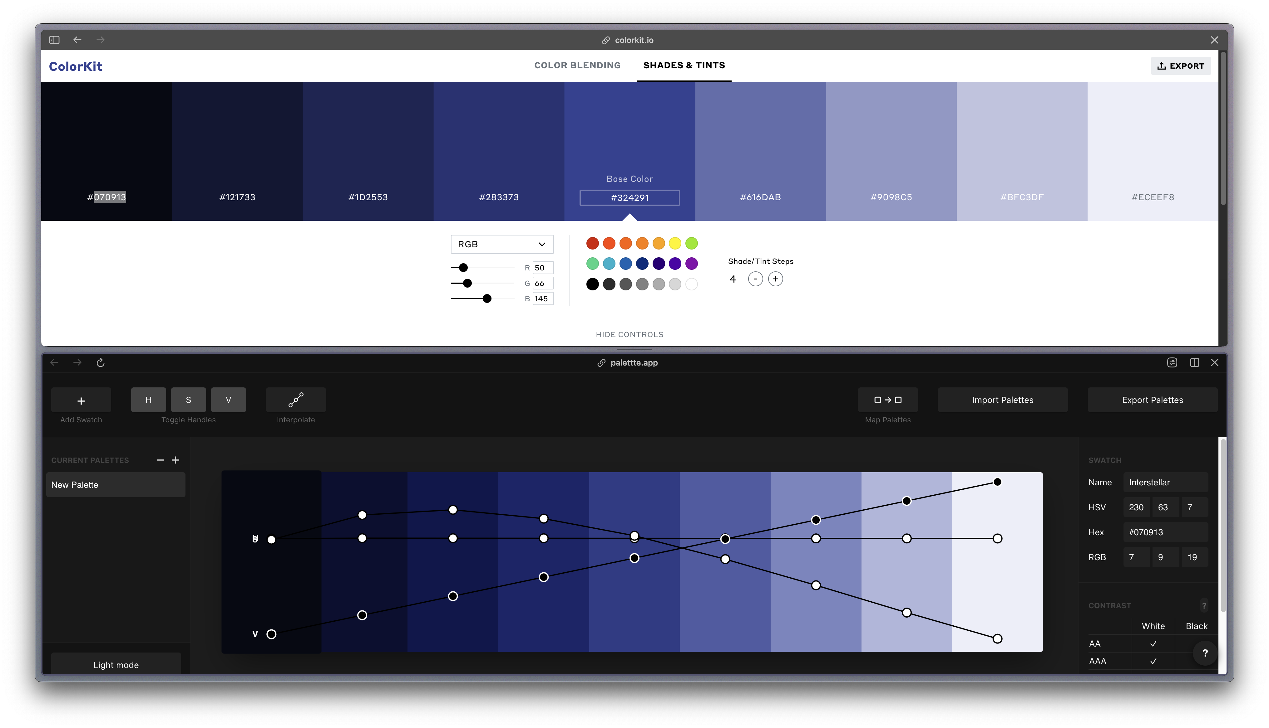
In the case above, I just used the first and last shade/tint, and the base color in the middle, in Color Kit as a baseline and tweaked the curves. You can already see a difference in how much more rich the darker colours are, probably.
Again, file this under it’s-not-that-deep, but this will likely be something I continue to practice now that I can’t unsee it.
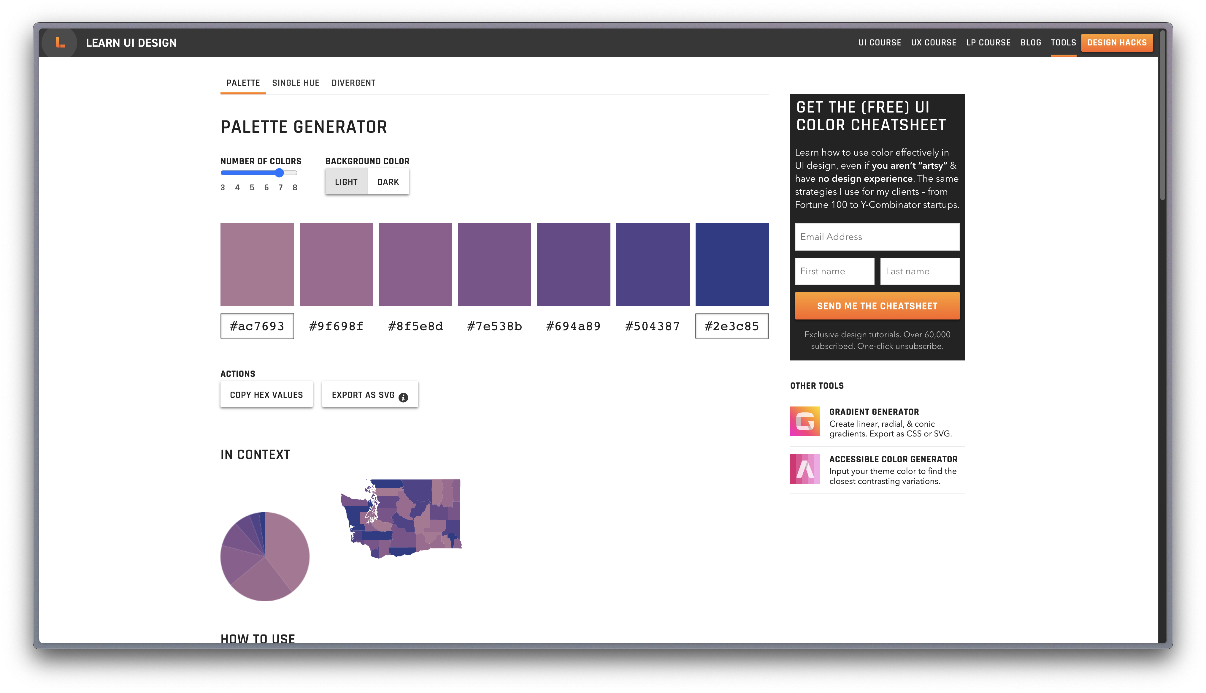
Another tangent: Erik’s got a bunch of really cool, very specific tools for colour theory, like this data-viz colour palette generator where you give it 2 colours and it’ll generate the rest of the colours, I’m pretty much foaming at the mouth:
 Today’s rabbit hole, ladies and themtelmen.